My Role:
Lead UX/UI Designer
Timeline:
4 Weeks
Tools Used:
Adobe Illustrator, Canva, Figma
Goal:
Redesign logo/branding and update the app layout for a seamless and easy to understand user experience.
My Contributions:
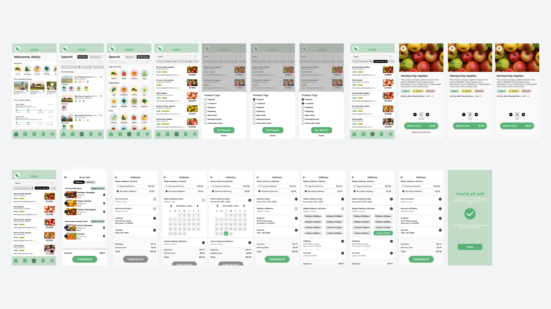


We each took the initiative to create individual logo designs for the app that would effectively communicate Mint’s offerings to customers. My concept involved retaining the original logo, incorporating a mint leaf as the dot over the “I,” and adding the word “Produce” beneath it. Ultimately, we opted not to use the Mint branding at all and decided to come up with a new name.
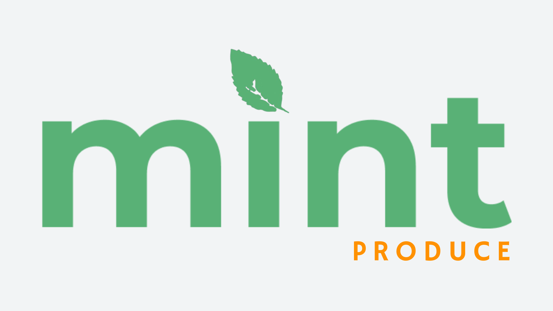

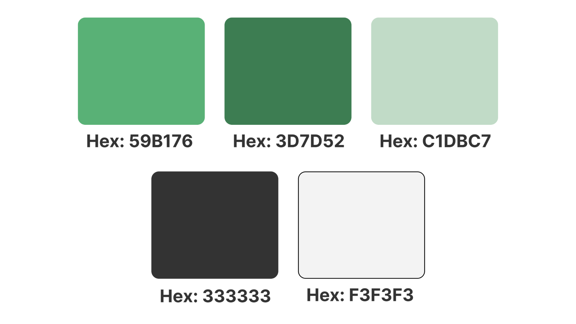

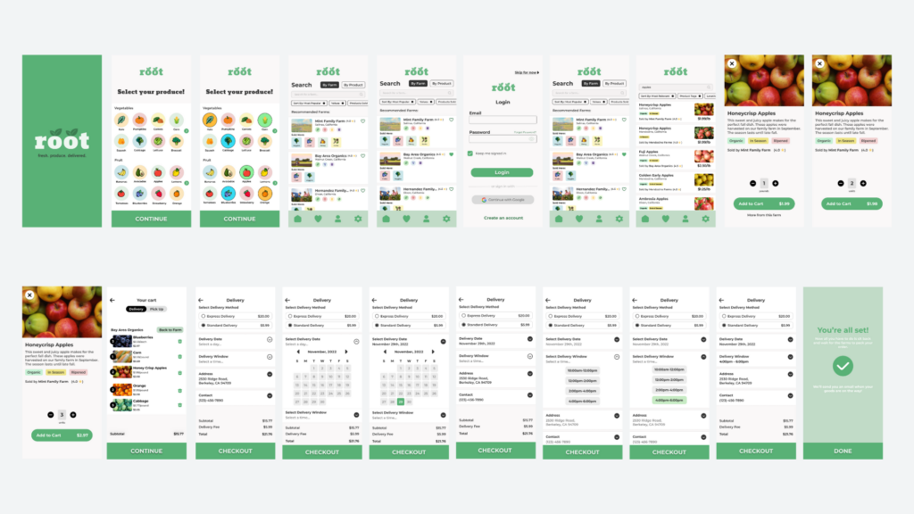
Integrating the new color palette into the layout design makes it feel more streamlined and user-friendly.

Challenges
During my time at the startup initially known as Mint (later rebranded as Root), the design team and I encountered several challenges in our rebranding efforts. Our creative ambitions aligned on the need for a significant brand overhaul, but we faced resistance from company ownership.
The primary hurdle was convincing the owners of the necessity and benefits of rebranding. We had to clearly articulate the issues and confusion caused by retaining the Mint name, as well as the potential advantages of a fresh identity.This process involved numerous meetings and presentations to gain their buy-in. Once we secured approval to explore a new name, the implementation phase presented its own set of obstacles.
What I Learned
The months spent working to develop this app has honed my ability to effectively communicate strategic ideas to senior leadership. I learned to present concepts I believed would drive long-term company success, approaching discussions with respect and openness even when faced with resistance. This experience taught me to gracefully accept when my proposals or approaches were not adopted by the majority.
Additionally, I refined my leadership capabilities by guiding a team in developing user-friendly UI, logos, and branding elements. This role allowed me to cultivate a collaborative environment that fostered creativity and innovation while maintaining alignment with company objectives.
