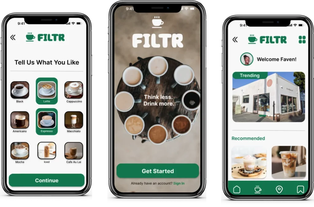
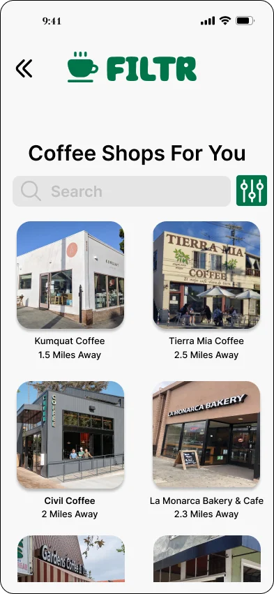
I have learned a great deal in my User Experience course. One of the most interesting tasks we were assigned was to design a hotel app with a consistent theme that was fully interactable for the user. I have taken the skills learned during the course of that project and applied it to this project. My goal for this app, named Filtr, is to create a concierge app for coffee lovers based on their personal tastes. The goal of this app is to help users locate coffee shops they’ll like and make quicker decisions when ordering.
Defining the Problem
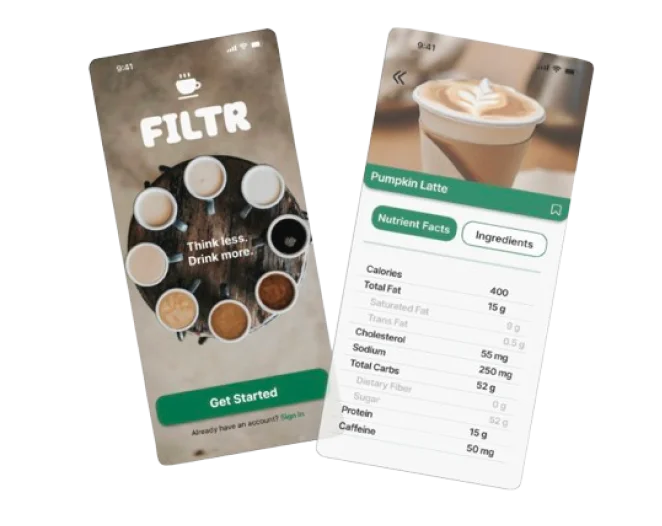
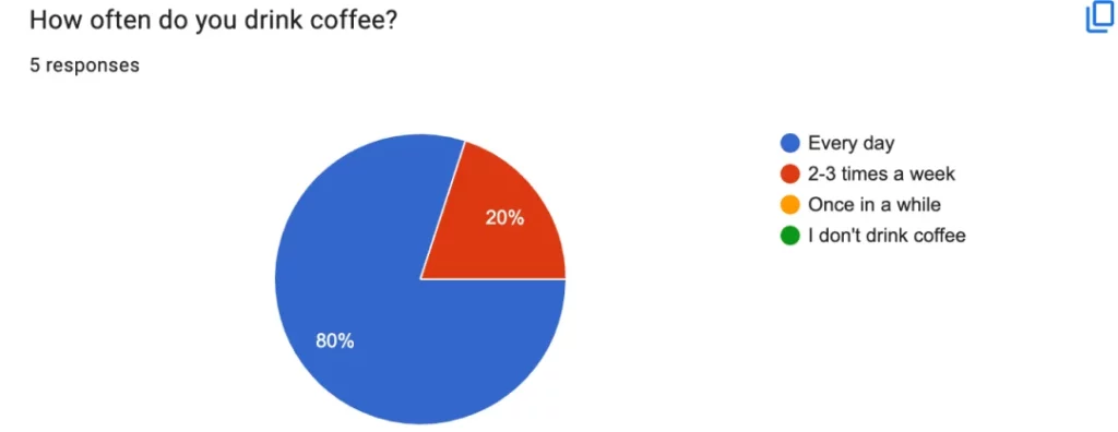
After conducting thorough user research, I noticed the majority of users wanted to be better informed of the ingredients and content of the coffee drinks they ordered. Also, even when using Google or Yelp, they still found difficulty making a decision when ordering, particularly when visiting new establishments:
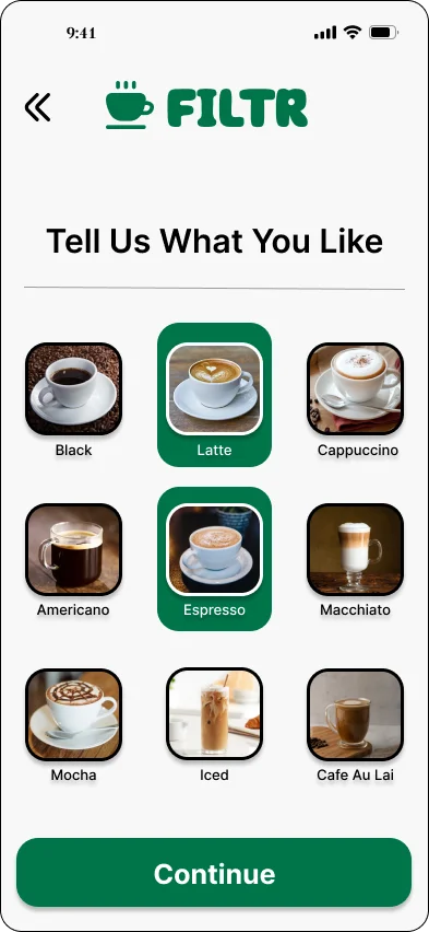
People want recommendations of coffee based on their tastes, while also being better informed of the coffee selection, price, and ingredients.
Brief
2 weeks
Role
UX/UI Design
Responsibilties
UX/UI Designer Researcher
User Research
Prior to putting pen to paper to sketch mockups of the Filtr app, I decided to get a clearer picture of what users want and need when it comes to a coffee curator app. Here are the questions I asked users to respond to via online survey and in-person interviews:
Questions I asked
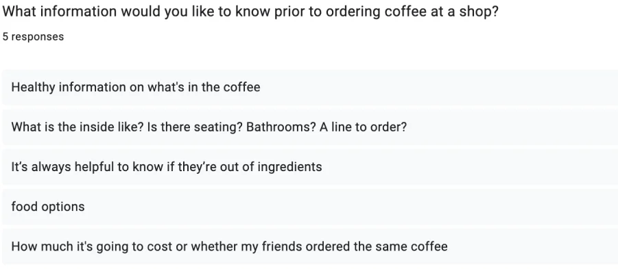
What information would you like to know prior to ordering coffee at a shop?
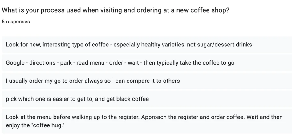
What is your process used when visiting and ordering at a new coffee shop?
What are some frustrations you’ve experienced when ordering coffee?
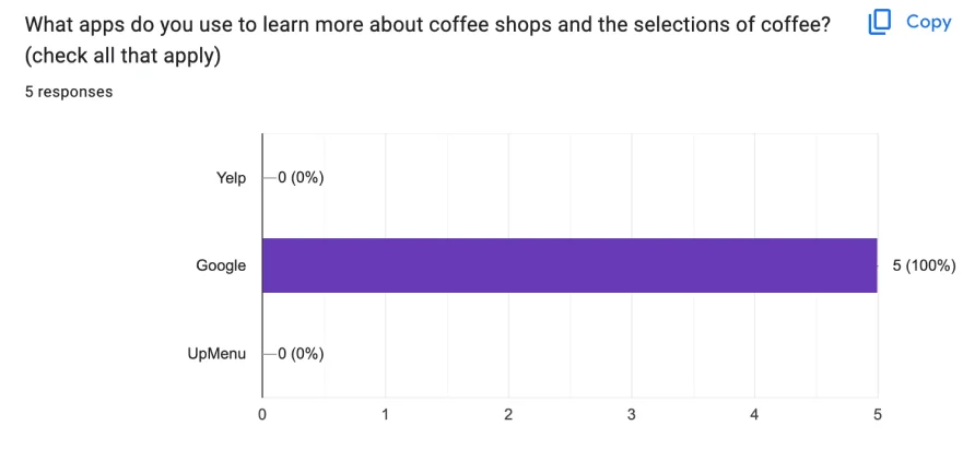
What apps do you use to learn more about coffee shops and the selections of coffee?
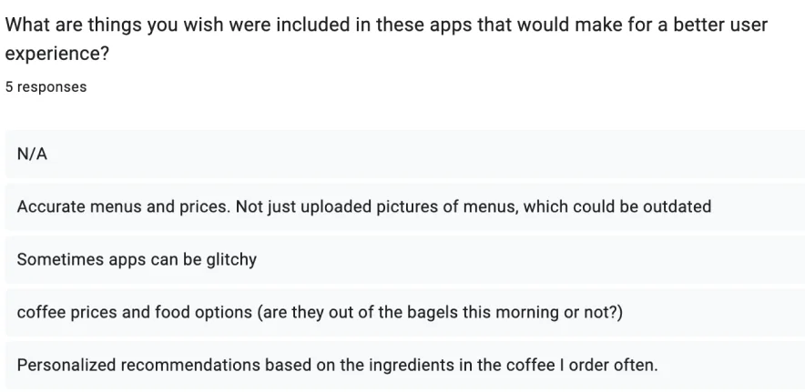
What are things you wish were included in those apps that would make for a better user experience?
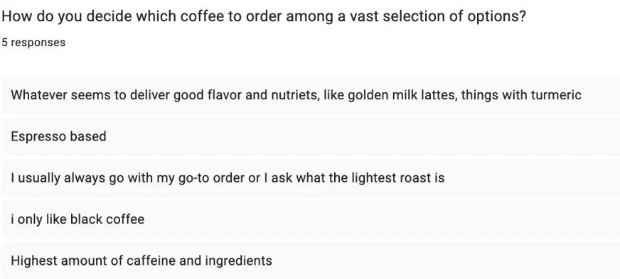
How do you decide which coffee to order among a vast selection of options?
People want recommendations of coffee based on their tastes, while also being better informed of the coffee selection, price, and ingredients.
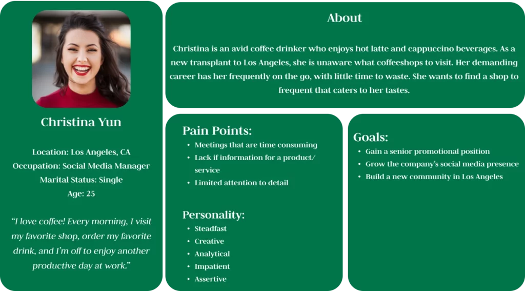
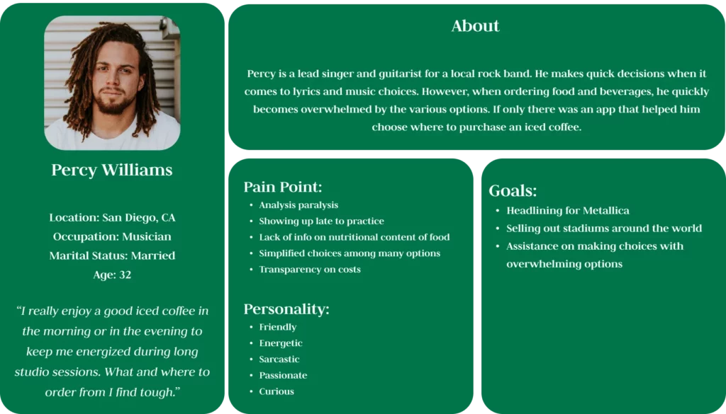
User Personas
Based on the feedback received from over 15 users, I decided to create user personas to represent the common goals, personalities and pain points.
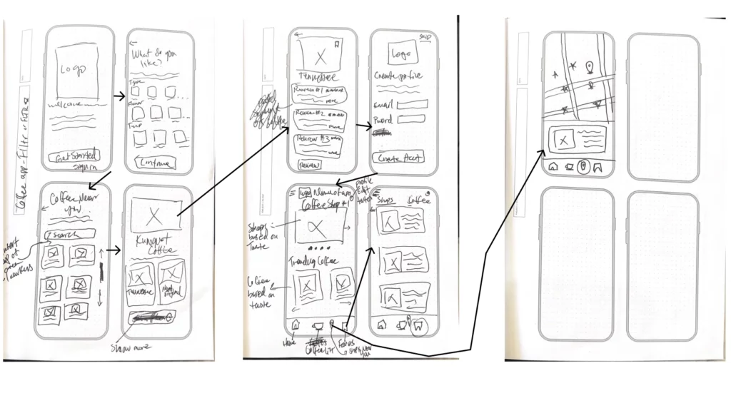
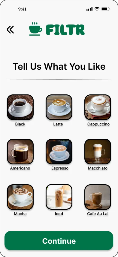
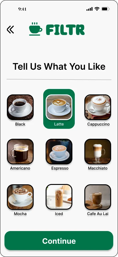
Wire Frame Flow
Upon finalizing the introduction page, I decided to wireframe the user journey as follows:
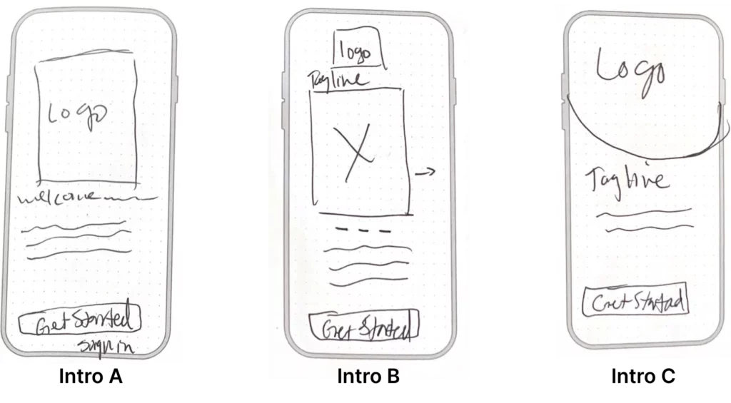
Initial Wireframing Process
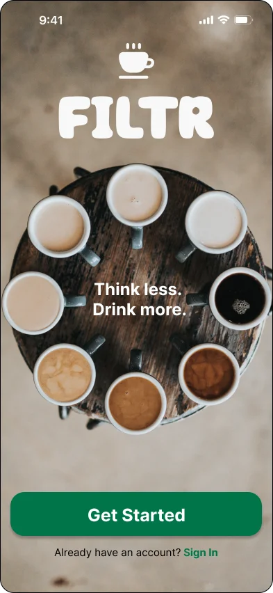
When creating the first screen, I wanted to design a page that informed the user about the app and get them started on their journey as soon as possible. I designed Intro A to be simple and informative, with a very short description of the app. Intro C is similar to Intro A, yet differentiates itself with an added tagline. Intro B is more informative with a carousel that users can scroll through and learn about the app prior to clicking the “Get Started” button. I put these three options in front of my users to see which would be the best user experience.
Wireframing process: Selection
The response I received back from the user survey overwhelmingly pointed to Intro C as the most simple and easy to understand design choice. Many potential users also told me to not include extra information, and that just the log, tagline and “Get Started” button was enough. I changed the color of the text and buttons from the pastel blue to dark green after adding in the background image. I felt this color change brought the whole screen together.
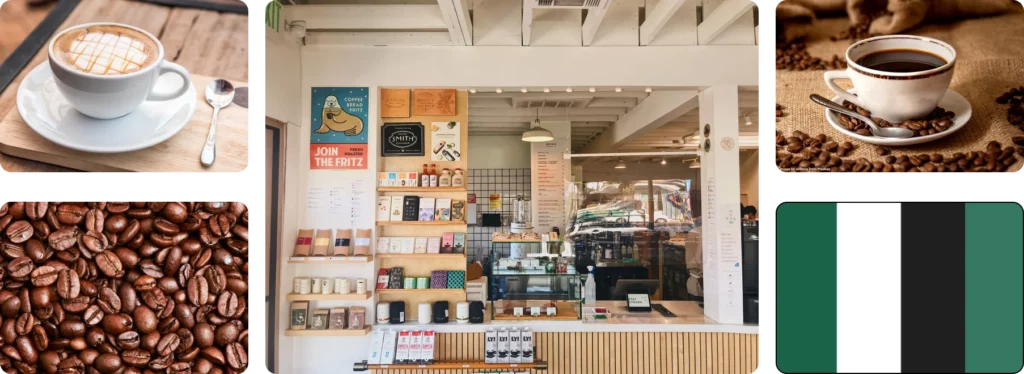
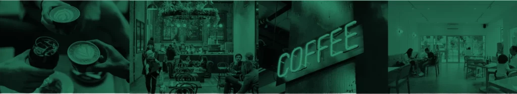
Moodboard
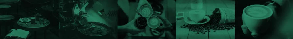
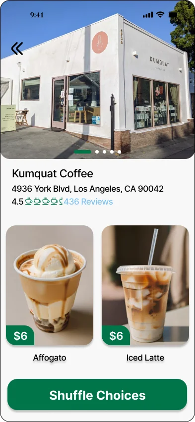
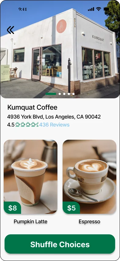
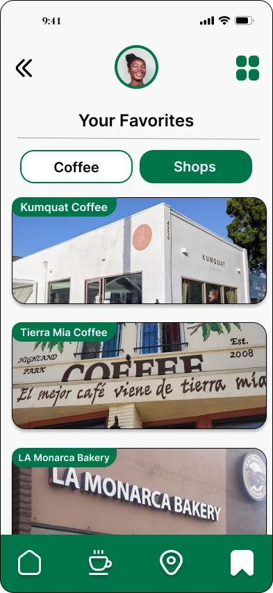
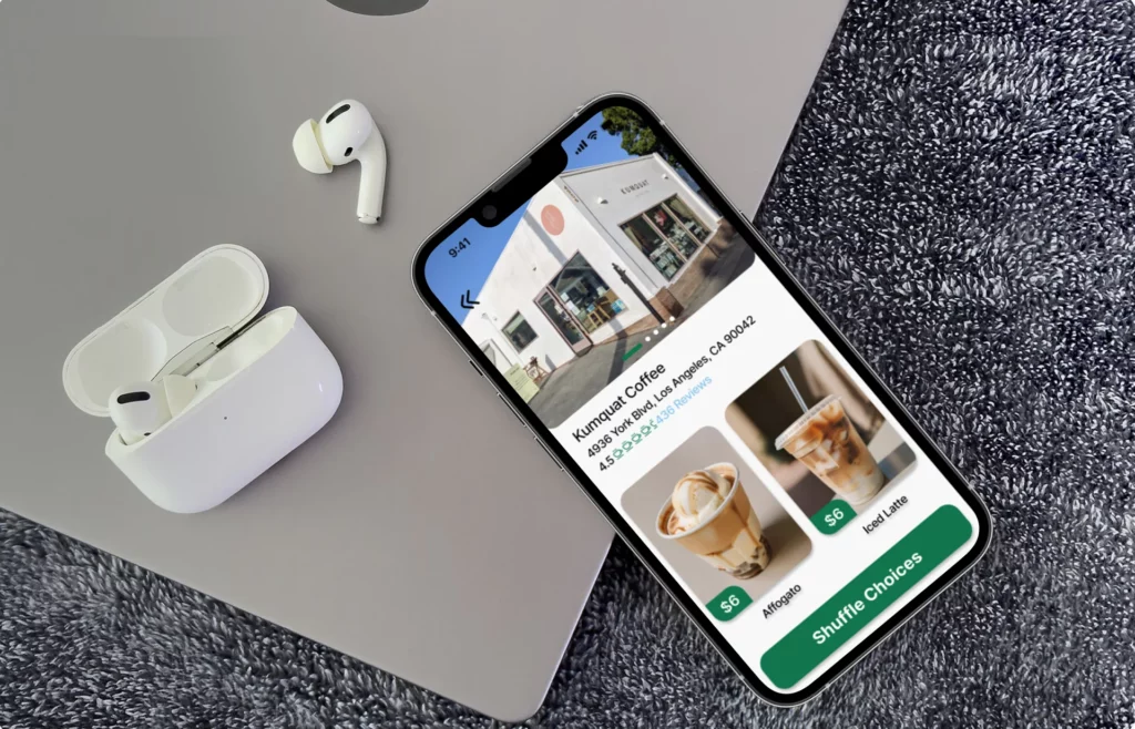
Below are images representing my inspiration for creating this app. The image in the middle is most prominent because it is of my favorite local coffee shop, Kumquat Coffee, that I frequent daily.
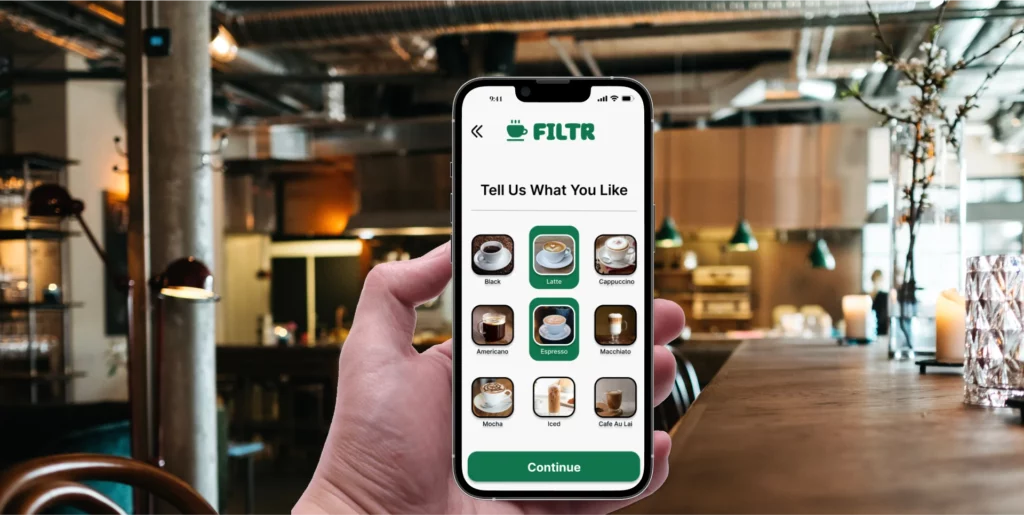
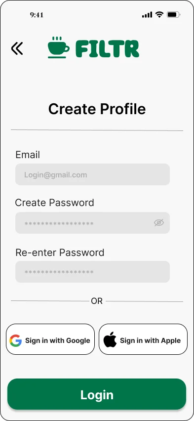
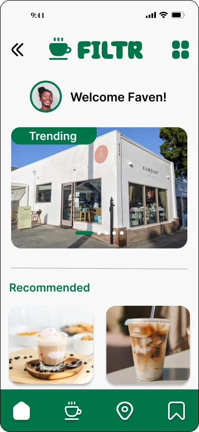
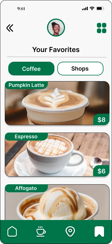
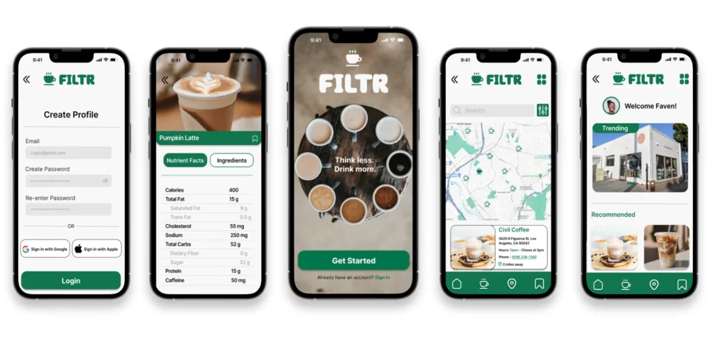
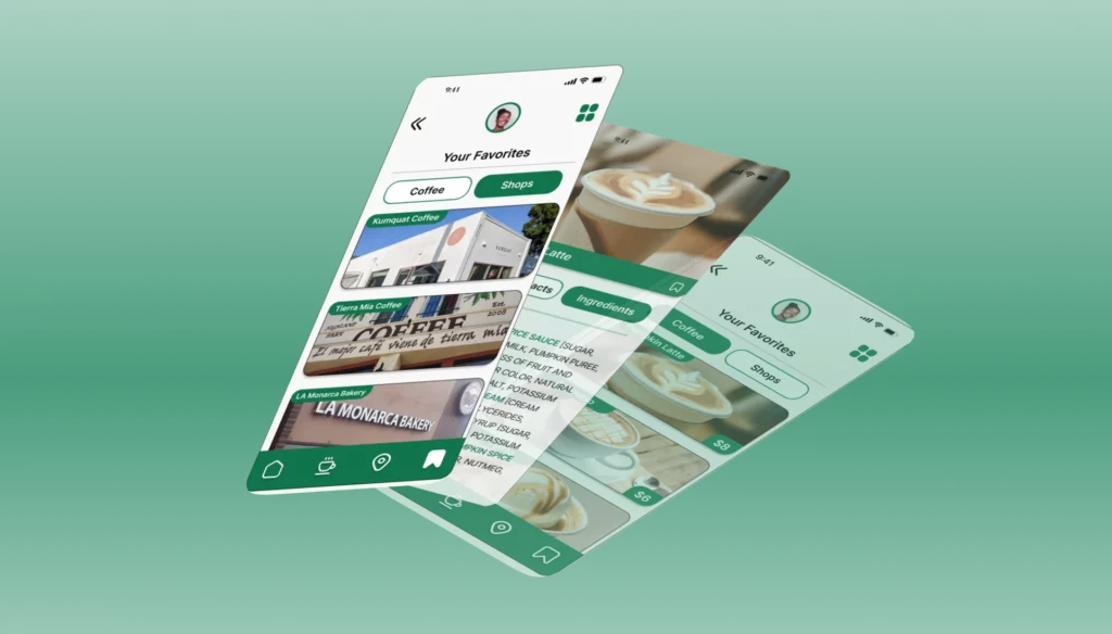
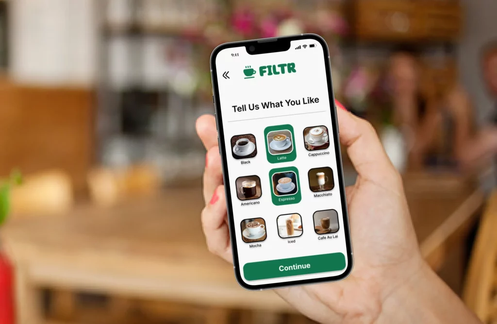
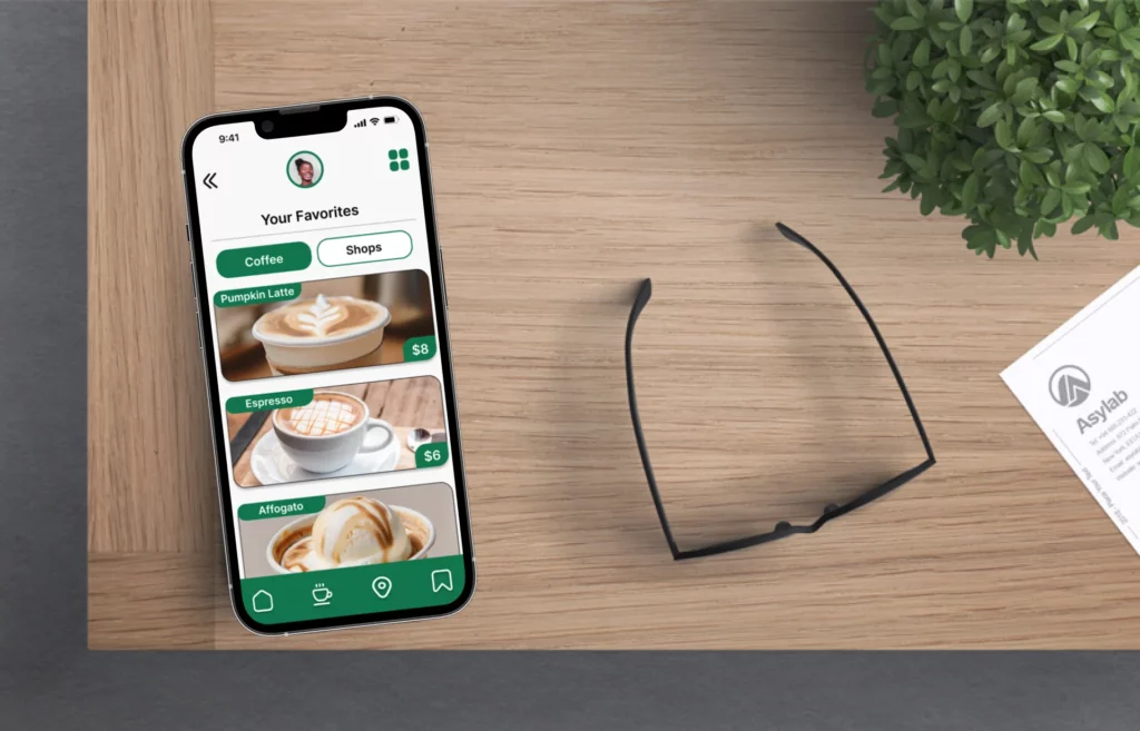
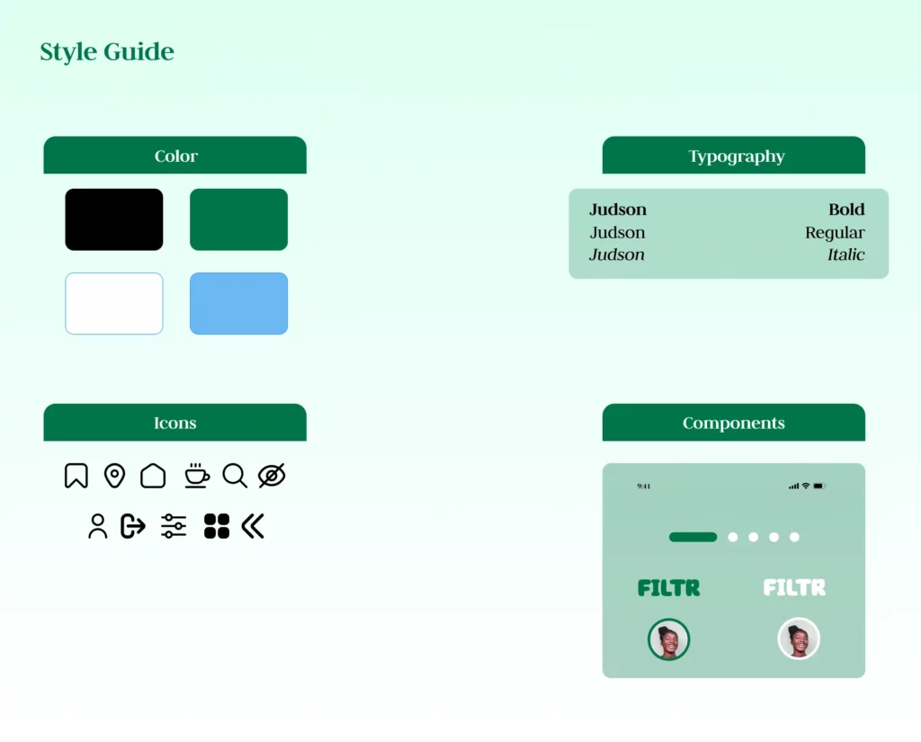
High Fidelity Wireframe
Reflection
I found this product design assignment challenging but enjoyable, as both a designer and a coffee aficionado. I made sure to address and implement solutions for the pain points gleaned from user research, while also creating a seamless, user friendly experience. If I could change one thing in my process, I would settle on a color palette earlier so as to not spend too much time updating the design layout. In future assignments, I would try to work out color options as early as possible to avoid multiple revisions.