Goal:
Design a modern, intuitive, user friendly, and informative new dashboard
for the Revlon R&D team. Other details of the assignments cannot be revealed at this time due to the signing of an NDA.
My Contributions:
Recognizing that this was a design sprint, I promptly sketched two dashboards to serve as the foundation for a low-fidelity wireframe. I added numerous notes and labels, some of which may or may not be reflected in the final design.
In this phase, I developed the low-fidelity wireframes for both dashboard versions. I included just enough detail to convey the overall vision for the final design. The dashboards are intentionally designed to be as simple as possible, prioritizing user experience and considering how frequently they will be utilized.
The color palette was inspired by Revlon’s iconic red from its logo. I aimed to keep the palette as straightforward as the design itself, maintaining the theme of simplicity.
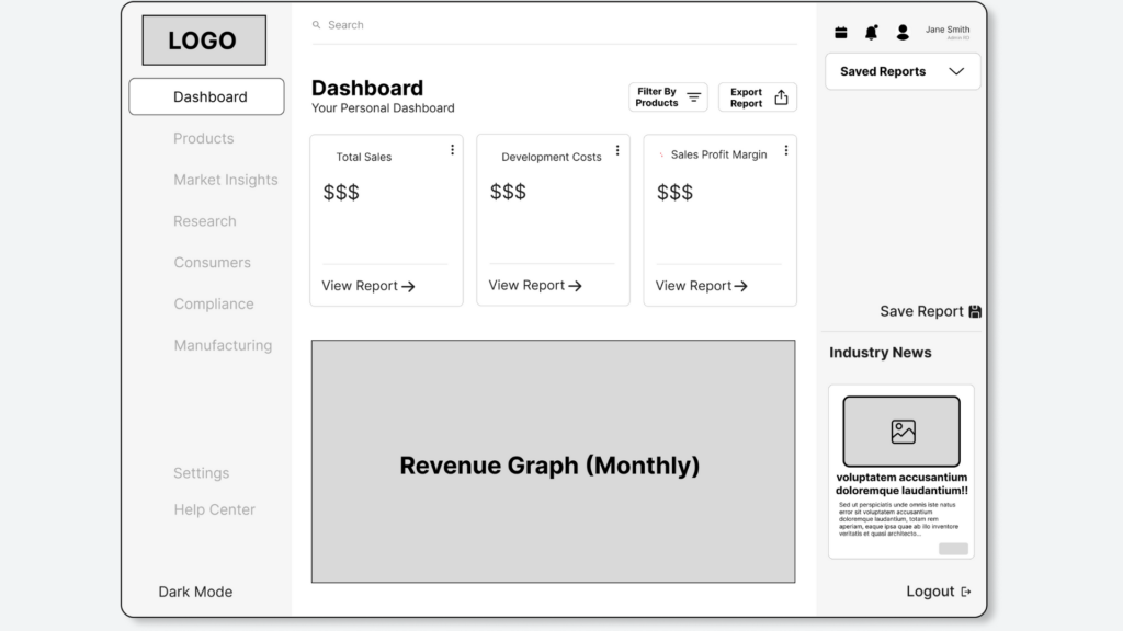
In the high-fidelity version of the R&D Dashboard, I labeled all the features and provided brief explanations for my design choices. This approach was aimed at enhancing the user experience, ensuring it is as seamless and easy to understand as possible.
For the Drilled Down View of the dashboard, I highlighted the additional detail accessible through a simple dropdown toggle. In this instance, the graph transitions from displaying Yearly Revenue to Monthly Revenue, providing a more granular view of the data.
Challenges
This project marked my first experience with a four-day design sprint, presenting a significant challenge in time management. Typically, my process involves designing, gathering feedback, iterating, and refining. However, the compressed timeline demanded a more streamlined approach.
I conducted design research, created initial sketches, solicited immediate feedback, and promptly developed digital wireframes for the dashboards. The accelerated pace left little room for second-guessing design decisions, compelling me to trust my instincts and move forward confidently with my best ideas.
What I'd Do Differently
Given more time, I would have incorporated additional interactivity into the designs. While I am proud of what was accomplished in just four days, I believe I could enhance the aesthetics and detail further—such as by adding a Dark and Light Mode toggle to each dashboard.
What I Learned
This design sprint taught me how to navigate the design process at an accelerated pace. Without these constraints, developing a high-fidelity design would typically take a minimum of two weeks. This experience also reinforced the idea that design is not solely about perfection; it’s about functionality and creating a seamless, user-friendly interface.